
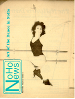
This is an example of an image that didn’t turn out well in print.
It was always a disappointment when the magazine came from the printer. We were excited to see the magazine after weeks of hard work getting the magazine written, edited, illustrated, designed and layed out, but it was always a letdown when we got our first look at the finished product.
The reason it was always a disappointment was the paper. We were not printing a four-color glossy magazine. We were printing on paper that was one step above newsprint (a paper stock oddly named Electra Bright), which was great for the budget, but bad for print quality. The problem is especially apparent in the appearance of photographic images.
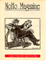
Line drawings looked good in print.
Printed images are essentially optical illusions. Gradations of light/dark (gray) in a printed image are produced by varying distribution of black dots. The smaller that dots can be printed increases the resolution of the image. The problem with cheap paper is that it absorbs ink, making it impossible to print very small dots. Also, cheap paper is not totally white — it’s an off white. So the combination of low resolution printing on off-white paper makes images look very dull.
The finished product was always disappointing because the boards (sheets of cardboard on which the magazine was layed out) where white and the images were crisp. The master from which the magazine was printed looked great.
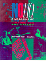
This is one of two four-color covers that didn’t turn out well in print, even though the design was great.
We learned to design the magazine using few photographic images and lots of block prints and line drawings.
Color was another issue for low budget, low volume printing that we were doing with NoHo Magazine.
Because we were printing in such low volume (less than 5,000 copies), the cost of pre-press operations were a big part of the overall print cost. Pre-press is when the boards are essentially photographed and sheets aluminum printing plates are made. Every color in the rainbow is rendered in print by combining four colors. To make a full color magazine, you need to make four printing plates — one for each of the four colors used to make every other color. To make a black and white magazine, you just need one color, black, which means you only need to pay for the production of one plate.
For the most part, NoHo Magazine was printed in black and white with one “spot” color, usually red, that was used on the front and back cover. Two issues had a four-color cover, which didn’t turn out very well.
Over the course of the run of NoHo Magazine we learned how to design the magazine within our budget constraints. You can see it in the magazine covers. The covers that worked well didn’t rely on high resolution imagery. In some cases we purposely distorted images to make them work in the medium we were printing.
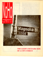
This is an example of a cover image that we purposely distorted to make it work in print.