Critic’s Dilemma: The story how a magazine provoked a creative community

movie_poster300_squareThe first time Jim Berg’s tires got slashed, he attributed it to a random act of vandalism. Within days, when his tires were slashed a second time, he got the message. Somebody was very angry about a scathing theater review he had published that month. After the third time his tires were slashed, he made a point of parking at random locations blocks from his home.

Such was the passion and angst that was aroused by NoHo Magazine, a small community publication based in the newly created NoHo Arts District.

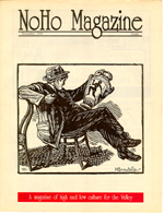
In 1992 a group of business leaders and theater operators voted to create the NoHo Arts District in North Hollywood, a Los Angeles bedroom community located in the San Fernando Valley. They were led by David Cox, artistic director of the American Renegade Theatre. Shortly after the founding of the arts district, Jim Berg began publishing NoHo Magazine, a monthly publication devoted to the arts and the NoHo community.

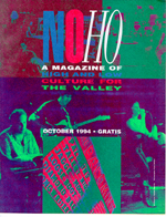
Over its 20-issue run, NoHo Magazine both celebrated and challenged the creative community of the NoHo Arts District. A mainstay of the magazine was theater reviews that took theater seriously as an art and featured writers who were as passionate about theater as those who were putting on the shows. While the magazine commented on the art of NoHo, it was also a product of NoHo, giving voice to the creative aspirations of the community.

Jim Berg says that he started NoHo Magazine with a “good idea and bad credit.” One year later he had created a magazine that was vibrant, smart and passionate. He had grown as a writer and publisher, but his financial condition had become dire. He was destitute, without a car and on the verge of being put out on the streets.

Until an act of God intervened.

The 1994 Northridge earthquake destroyed his apartment building with him in it, but he escaped with a few possessions and minor injury. The miracle came in the form Federal aid money, which he used to buy a car, pay a few months rent, and keep the magazine going. It was a new beginning, but it was also the beginning of the end for NoHo Magazine.

Perhaps the earthquake was a wake-up call – an event that caused Jim Berg to seriously ask the questions, “What are we doing? Is it meaningful? Is it worthwhile?” It was as if the earthquake demanded answers and inane, mindless pap could no longer be tolerated – it had to be challenged.

In the months after the earthquake, NoHo Magazine published reviews that were honest but harsh. People who were supporters of the magazine were hurt by what the magazine had to say about their work. They felt betrayed as the magazine that purported to be supportive of the creative community had turned against it.

Ten months after the earthquake, NoHo Magazine ceased publication.

Critic’s Dilemma is about the creative impulse in the face of nearly impossible odds and the desperate need to create meaning. It tells the story of NoHo Magazine and the beginning of the NoHo Arts District. It is about a community that harbored the unlikely vision of someday being comparable to the NoHos of New York and London. It is about a publisher who was uniquely unqualified to shepherd and champion a creative community that barely recognized itself. It is about how a person and a community discovered themselves and did not always like what they found, but nonetheless found something closer to the truth.

Next: Beginning >>

Beginning

Jim Berg, Publisher of NoHo Magazine 1993-1994

Jim Berg, Publisher of NoHo Magazine 1993-1994. Photo by Cindy Beal.

Twenty years ago, in January of 1993, I was 28 years old and I was lost, trying to find my way in a world that was full of dead ends, false turns and mismarked paths. I was failing. I was broke, emotionally adrift and losing the last remnants of meaningful connection to the world in which I was living.

And it was going to get worse.

The first issue of NoHo News, which would later become NoHo Magazine, came out in January of 1993. For that first issue I was the publisher, editor, and principle writer. It was 16 pages, one feature article, a publisher’s note, four theater reviews (three written by me), a cartoon, and nine advertisements. It was a good start to what would be a 20-issue run over nearly two years.

But it was not a cure for what ailed me. The advertising revenue barely covered the print cost and I was in the process of losing the part-time job that was supporting me. I was sliding down a gentle slope of desperation toward complete destitution. I don’t know why I wasn’t panicked by my situation. Perhaps I was conditioned by repeated disappointments to not look ahead, and just keep my head down, putting one foot in front of the other. I’ll deal with the cliff when I get to it. I didn’t realize that I had already gone over the cliff on a very shaky bridge that was going to completely collapse.

That bridge took a year to collapse, and when it did, I was rescued by a terrible miracle.

This is the story of two years of my life 20 years ago when I published 20 issues of NoHo Magazine. This is a failure story. Twenty years later I think that failure stories are important and need to be told. I will let you be the judge if I am right or not. By the end I think we will both have different ideas about what constitutes failure, if there really is such a thing.

Next: Delusion plus desperation equals inspiration

Publishing on paper, an imperfect medium

This is an example of an image that didn't turn out well in print.

This is an example of an image that didn’t turn out well in print.

It was always a disappointment when the magazine came from the printer. We were excited to see the magazine after weeks of hard work getting the magazine written, edited, illustrated, designed and layed out, but it was always a letdown when we got our first look at the finished product.

The reason it was always a disappointment was the paper. We were not printing a four-color glossy magazine. We were printing on paper that was one step above newsprint (a paper stock oddly named Electra Bright), which was great for the budget, but bad for print quality. The problem is especially apparent in the appearance of photographic images.

Line drawings looked good in print.

Line drawings looked good in print.

Printed images are essentially optical illusions. Gradations of light/dark (gray) in a printed image are produced by varying distribution of black dots. The smaller that dots can be printed increases the resolution of the image. The problem with cheap paper is that it absorbs ink, making it impossible to print very small dots. Also, cheap paper is not totally white — it’s an off white. So the combination of low resolution printing on off-white paper makes images look very dull.

The finished product was always disappointing because the boards (sheets of cardboard on which the magazine was layed out) where white and the images were crisp. The master from which the magazine was printed looked great.

This is one of two four-color covers that didn't turn out well in print, even though the design was great.

This is one of two four-color covers that didn’t turn out well in print, even though the design was great.

We learned to design the magazine using few photographic images and lots of block prints and line drawings.

Color was another issue for low budget, low volume printing that we were doing with NoHo Magazine.

Because we were printing in such low volume (less than 5,000 copies), the cost of pre-press operations were a big part of the overall print cost. Pre-press is when the boards are essentially photographed and sheets aluminum printing plates are made. Every color in the rainbow is rendered in print by combining four colors. To make a full color magazine, you need to make four printing plates — one for each of the four colors used to make every other color. To make a black and white magazine, you just need one color, black, which means you only need to pay for the production of one plate.

For the most part, NoHo Magazine was printed in black and white with one “spot” color, usually red, that was used on the front and back cover. Two issues had a four-color cover, which didn’t turn out very well.

Over the course of the run of NoHo Magazine we learned how to design the magazine within our budget constraints. You can see it in the magazine covers. The covers that worked well didn’t rely on high resolution imagery. In some cases we purposely distorted images to make them work in the medium we were printing.

This is an example of a cover image that we purposely distorted to make it work in print.

This is an example of a cover image that we purposely distorted to make it work in print.

First blind step forward

On November 06, 1992, the Los Angeles Times published an article entitled “NoHo : With theaters, cafes and a hip atmosphere, North Hollywood may become the ‘Melrose of the Valley.’

The article described the activities of business owners and public officials who were trying to revitalize and raise the creative profile of the area of North Hollywood centered at the intersection of Lankershim and Magnolia boulevards.

Published in the first issue of NoHo Magazine, Steven Lee Stinnett's cartoon captures the moment of creation of the NoHo Arts District.

Published in the first issue of NoHo Magazine, Steven Lee Stinnett’s cartoon captures the moment of creation of the NoHo Arts District.

The cultural affairs committee of the North Hollywood/Universal City Chamber of Commerce had voted to formally recognize the area and give it a name: the NoHo Arts District.

Having been to the area a few times to see improv comedy and poetry readings, I had felt the curious creative vibe that seemed to come from this run-down part of the Valley. To be sure, it was absolutely nothing like the vibrancy and night life of Melrose Avenue, but it had its own low key, low budget creative energy.

I immediately recognized that I should bring my idea for a Valley arts publication to these NoHo people. I contacted the NH/UC Chamber of Commerce and they put me in touch with David Cox, who was one of the driving forces behind the NoHo Arts District. When I spoke to David and told him about my idea, he said “Great! Call it NoHo News and come to the next meeting of the cultural affairs committee and I’ll introduce you around.” So I did, and he did, and we lined up nine advertisers for the first issue of NoHo News.

Then I had to learn how to print a magazine.

Next: Publishing on paper, an imperfect medium

Delusion plus desperation equals inspiration

In the fall of 1992 I once again found myself at a loss as to what to do with my life. It had been a almost two years since I gave up pursuing a career in law enforcement; I was losing interest in graduate school, and my brief stint as a radical labor organizer was coming to an unceremonious end.

Clearly my life didn’t have a theme that was driving me forward to some great meeting with Destiny. Nor was I satisfied to simply make a living, pay my bills, and work at being a productive member of society, while making the big questions such as “What is the purpose of my life?” a part-time pursuit, like most functional adults do.

I also had no interest in making a family, nor did I have a “significant other” who might steer me in that direction. I had nothing and nobody to nudge me in any particular direction. To be honest, however, there was almost certainly a significant chunk of my character that wouldn’t take direction from anyone if it were offered. I was going to find my own way, dammit, and when I do, I will know it’s mine.

So in the latter half of 1992 I turned to that great refuge of misfits since the beginning of time, “The Arts.”

At the time I was living in the northern San Fernando Valley, near California State University, Northridge, from which I had graduated in 1988 and where I was giving a go at graduate school, studying Speech Communication on the recommendation of a friend-of-a-friend.

For those who are unfamiliar with L.A.’s physical and cultural geography, “the hill” refers to the Hollywood Hills, which divides metropolitan Los Angeles from the San Fernando Valley. On the southern, metro side of the hill are the world famous communities of Bel-Air and Beverly Hills. On the Valley side are less famous cousins like Encino and Sherman Oaks. The iconic Hollywood sign faces south, over Hollywood proper, and its ugly prop backside faces North Hollywood in the Valley.

The thing you have to understand about the San Fernando Valley is that, despite the fact that it is a part of Los Angeles, it is a suburban cultural wasteland. When I looked around me, I couldn’t find “Art.” The San Fernando Valley doesn’t inspire artists. At best, artists are inspired to create parodies of the San Fernando Valley and its vacuous, materialistic, desperate, terrified sense of value and values. Artists love to hate the Valley.

Being naive and inexperienced, I didn’t think the Valley was getting a fair shake. I thought there must be art and artists in the Valley, and they were simply being overlooked by the elitist hipsters over the hill. I came up with the idea that what the Valley needed was a publication to champion art and artists of the Valley and the fact that such a publication didn’t exist was evidence that such a publication was needed. It didn’t really occur to me that the opposite was more likely the truth — that the fact that such a publication didn’t exist was evidence that it wasn’t needed. But I was naive and in need of a mission, and perfectly capable of making my own logic to meet my needs.

So with logic and letterhead in hand, I set out in search of Art in the Valley. What I found was a small community of people who were equally deluded or inspired as I, and together we helped create the NoHo Arts District.

Next: First blind step forward